Prairie Style
1. Some key concepts from this video are Frank Lloyd Wright invented picture windows and open living spaces. I was surprised to find out that the prairie style does not solely mean a style like 'on the prairie' like I originally thought, it means so much more. It is an open floor plan, that has rooms that flow into one another as well as floor to ceiling windows.
2. This relates to our textbook because it goes into depth about styles of architecture and a designer (Frank Lloyd Wright). It showed the floor plans and ideas that go into building/designing a home.
3. My opinion on this film was that it enriched my knowledge of architecture, and the evolution of the prairie style.
4. I chose this film because it had a very interesting title, I was curious as to what the video would be about.
Frank Gehry: Architecture as Art
1. Some key concepts from this video are that Frank Gehry does not plan, he responds to the place/time/people and comes up with something on the spot in his art work. He also tries to connect emotions to his work. He wants to change the face of modern architecture.
2. This relates to our textbook because this video further delves into the field of architecture, and discusses how art=architecture. It explains more than our textbook does about modern architecture and it also gives visual examples of architectures, as well as an interview with a famous architect.
3. My opinion on this film is that it was very interesting. I liked 'being inside the head' of Frank Gehry, and getting to see his art through his eyes. I think it helped me understand architecture and the structural elements involved more than just the textbook did.
4. I chose to do this video because art and architecture to me are very similar things. I wanted to explore how they are one and the same, and I felt that this video would help me do that, and teach me some things about how art and architecture are intertwined.
Thursday, June 30, 2011
Videos
Through the Eyes of a Sculptor
1. Some of the key concepts that I learned while watching this video are that there are a series of ranks for becoming a 'sculptor'. There are positions such as apprentice and master. I learned that in order to make beautiful sculptures you must have a love and understanding of the material you are working on. You also have to have a strong sense of culture, and ideas of what to sculpt.
2. This video relates to the reading in the text because it delves deeper into sculpting and the techniques involved in sculpture. It gives voice to a real artist, who shares his ideas and thoughts on sculpting.
3. My opinion of this film is that it really helped to supplement the reading from the text. I found it so interesting to see how long it takes to create a piece, and all the steps that are needed. From the clay, to the plaster to the final marble. It is amazing to watch.
Glass and Ceramics
1. Some key concepts that I learned is that glass and ceramic are some of the oldest materials that are man made. I also learned that glass is made from sand (which is one of the most abundant materials on earth). I found it interesting the sand goes through such a dramatic change when heated. I thought it was so interesting to watch someone create blown glass, it is a beautiful process. I found that it was interesting to know that ceramic is stronger than steel and all of its uses (medical, auto and other things).
2. This video related to the text because it went further to explain and show exactly how glass and ceramics are created. We would not have been able to have such a solid understanding of the creation process without the use of a visual video.
3. My opinion on this film is that it helped me to visualize where glass comes from as well as ceramic. It makes me have a better appreciation of the skill needed to create this materials, and through this it becomes an art form.
Installation Art
1. Some key concepts I learned from this video are that there are many different definitions of installation art. My favorite was that the art takes over the space. I learned that the art may change the building itself or the space that it is in. One quote said that 'installation art does not fit neatly into museums'. I never thought about this, but the art changes the space, and sometimes it is too big for a room to contain.
2. This video related to the text because it took the topic of installation art, got people's opinion of it, and showed many various examples of it.
3. My opinion on this film was that it helped me understand installation art better. I was confused about exactly what installation art is. We have a project on it this week, so I was grateful to have this video for reference.
Sunday, June 26, 2011
Art Gallery Visit #1: MoMA
This past week I had a great opportunity to visit the MoMA in NYC. There were a ton of great paintings and sculptures, it was hard to choose just 3 for each question!
Which artworks would I like to know more about? Why?
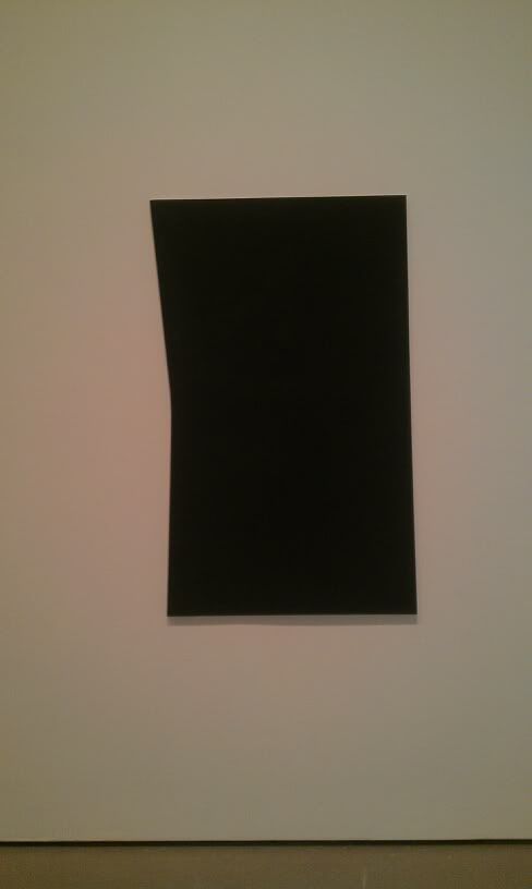
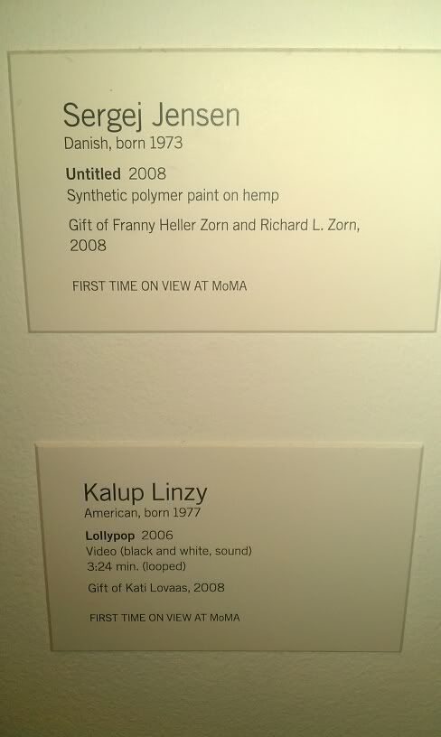
This painting by Sergei Jensen was really interesting. It is described as being 'synthetic polymer paint on hemp' it was created in 2008. This was one of the first pieces of art I saw, I was drawn to it simply because it challenges what art 'should' be. I want to know more about what the artist was thinking, and what his intentions were with this painting.
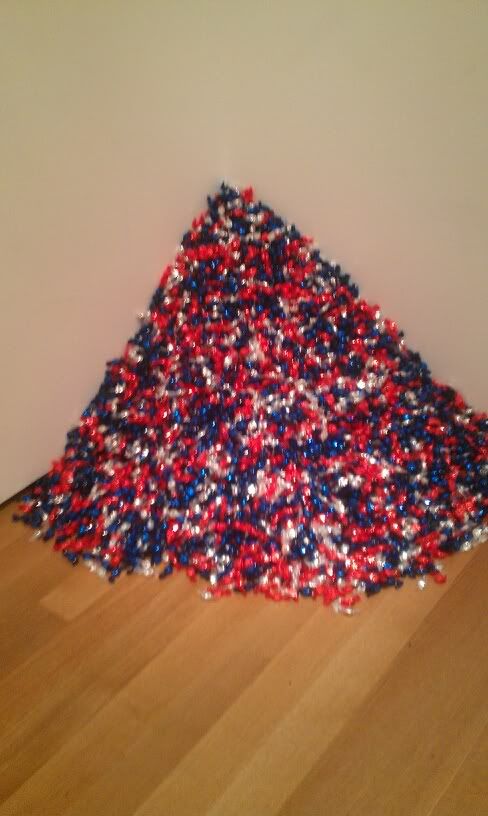
I would also like to know more about this piece of artwork. This is a piece by Felix Gonzalez-Torres. It is titled Untitled (USA Today). It is made up entirely of wrapped hard candies. It says on the description that is is a 'never ending supply'. I am very curious as to what that means, and what he is trying to say in this piece. I thought he might be commenting on American consumption due to the never ending supply and the comment that the medium is food.
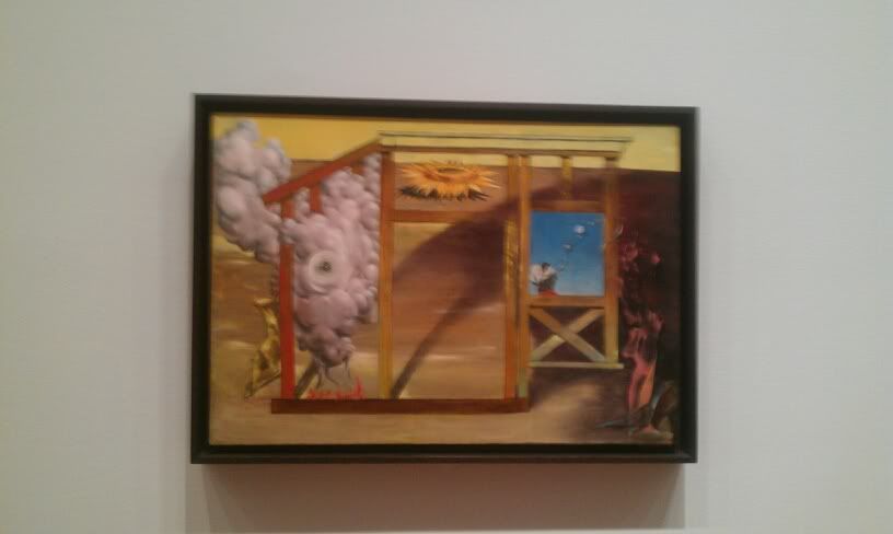
This is a piece that I would also like to know more about. It is by Dorothea Tanning, and it is a painting. It is titled "On Time Off Time". Although the medium is very common, I found this painting to be very uncommon in it's subject matter. It depicts many different things in one painting. I would like to know more about why/how this painting was created, and what the artist was trying to convey with this piece.
Which art works do I feel a connection with, Why?
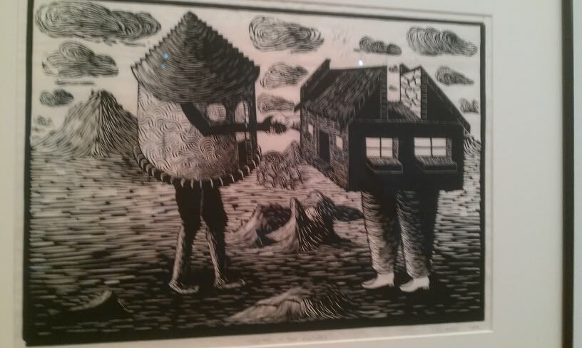
I felt a connection with this piece which is titled Meeting of Two Cultures and is by Sandilo Goje. It is made of a linoleum cut. I felt that this piece really speaks to modern culture. It shows the mixing/meeting of two distinctly different cultures. One culture is a traditional hut, while the other is a more modern house. We can all relate to seeing a different culture for the first time. I also like how the two houses are shaking hands showing they are friends.
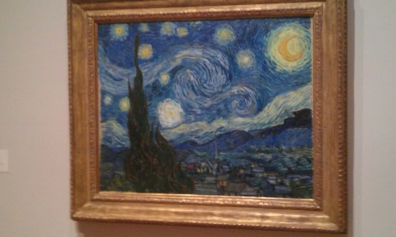
This is The Starry Night by Vincent van Gogh. This is my favorite painting. I love the colors and the swirls and how it is up for interpenetration. I love the glowing orbs in the sky and how it seems calm and peaceful. I have a strong connection to this piece, and I always find myself drawn to it whenever I visit MoMA.
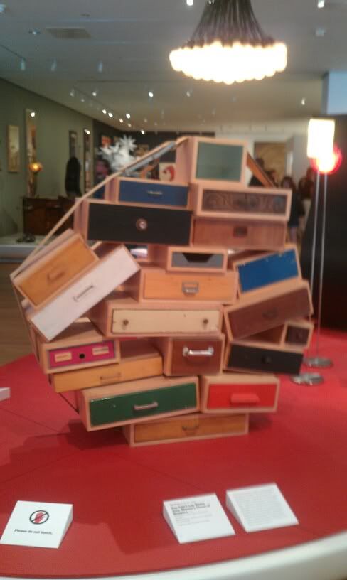
This piece of art is called "You Can't Lay Down Your Memory Chest of Drawers" by Tejo Remy. I thought that this piece was so interesting. We all have a 'memory chest of drawers' where we store our memories and feelings. All the drawers are different and have happy/sad/angry etc emotions stored in them. We carry around all these emotions and we can't lay them down. I felt that this was such a beautiful and special piece, that you just don't come across so often.
Which art works made an impact or an impression on me, why?
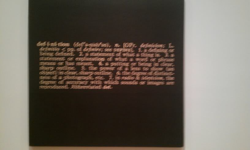
This piece of art by Joseph Kosuth shows the word definition, and then the definition of definition. I thought that this was very interesting and striking. There is no other art around this piece, and it hangs on a large white wall. It makes you really stop and think for a second.
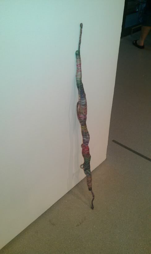
For a second, I thought that this piece of art was someone's walking stick or umbrella. But upon further examination, I came to realize that it is actually art! This piece is called "Psychedelic Soul Stick no. 55" by Jim Lambie. I thought that this piece was so interesting because it is just unassumingly perched up against a wall. Many people just walked past it. I'm also curious to see the other 54 soul sticks. I loved this, I felt that it had a tribal feeling, and it felt powerful.
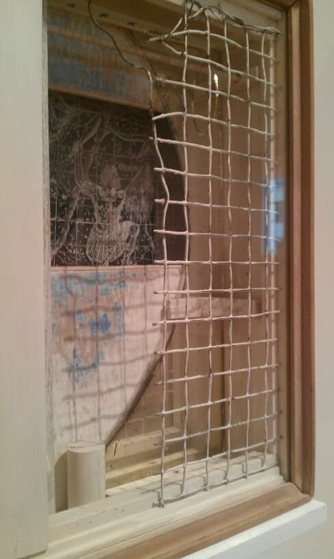
This piece by Joseph Cornell entitled "Central Park Carousel in Memorium" is very interesting. It appears to be pieces of a carousel encased in glass. The netting created a trapped feeling to the whole piece. It was also unsettling to look at for too long. I thought it was very interesting to see, and look at how everything was contained inside this small glass case. I would like to know more about this piece, and find out what it has to do with Central Park.
Friday, June 24, 2011
Logo Project!
1. Discuss what you thought about creating your logo.
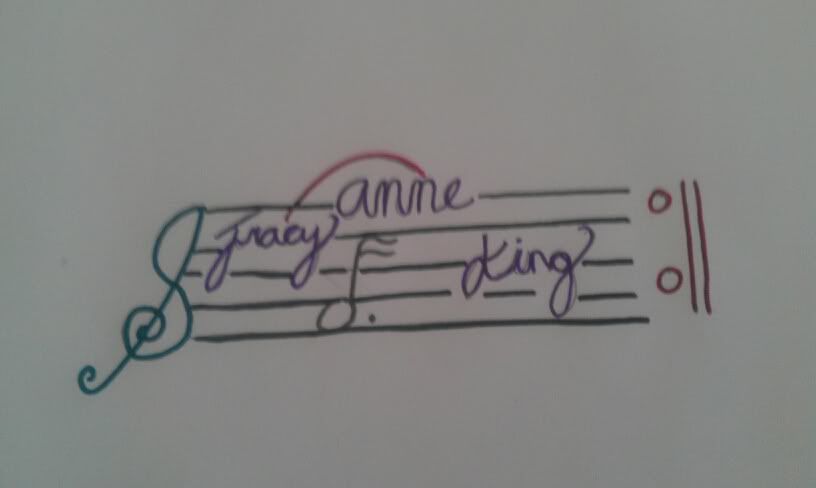
I really had a great time coming up with an idea for a logo, and the creating the logo itself. At first it was hard to come up with something that was simple and could describe me. But after some thought and sketching, I am really happy with my end result.
2. Describe the process: creative thinking skills and ideas you used in the logo creation.
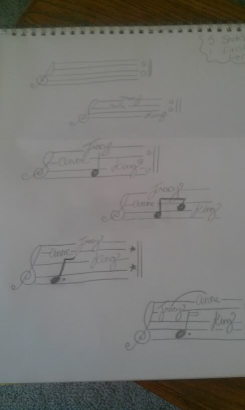
At first I made a list of possibilities, this list included music, dance, ice coffee, books, sleeping etc. Then I narrowed it down to music. I started to sketch from there using my tattoo (treble clef) for inspiration. As each drawing progressed I figured out where I would like to place things, and how it should flow.
3. What was the most important discovery you made in the creation of your logo?
I would say the most important discovery was the fact that a logo needs a central theme and it needs to flow. You can't just throw together your favorite things and expect it to look decent. You need to narrow down your ideas, and make sure that everything works together, and that it is simple and visually appealing.
4. What is the most important information you learned from watching the videos, powerpoint, and reading material for this project? What is your opinion of the videos?
I think that the most important thing I learned came from the video. I was thinking to myself that this client was really hard to please. I loved the design that looked like splattered paint. But when the client said that it needs to work across a spectrum of mediums and needs to be more simple, it made sense to me. Sure the paint splatter looked awesome, but it was not business like, and a logo must fit the company/person/idea that you are trying to market/express. I really liked the video, and I felt that it really helped me understand the importance of creating a logo, and how to go about it.
Saturday, June 18, 2011
Color Wheels and Value Scales!
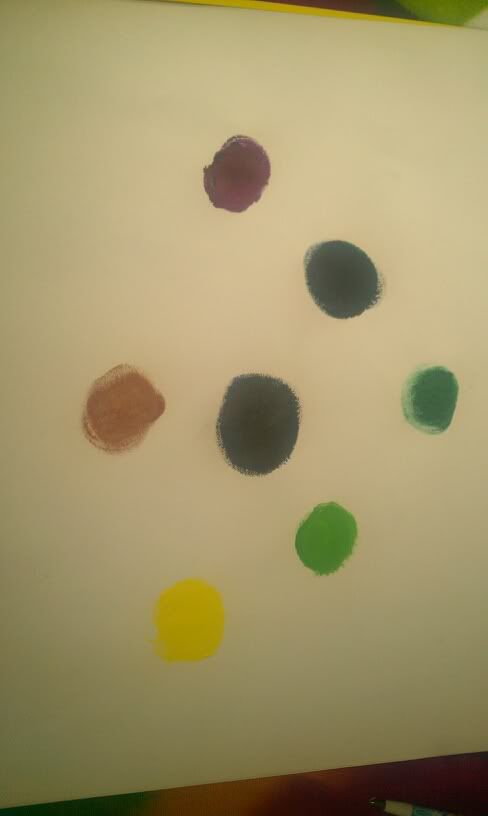
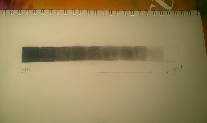
I really had a great time creating my color wheel and value scale. It was exciting for me to get a chance to be creative, and to work with new mediums. I liked making the color wheel the best because I love using paints of any kind, so getting to mix paints was really an adventure for me. I think however that I might have purchased the wrong shade of cyan at my local art store. I had a great time experimenting and through trial and error on both projects, I was able to achieve a product that I know I tried my hardest on.
I think that the videos were really helpful. Without the videos I would have been a little lost on what to do. I had a rough idea of what a color wheel should look like, but the video really helped me get started. The most useful thing I learned from the video was to put the colors you are going to mix next to each other, it makes it easier to blend. I had no idea what a value scale even was until I saw that video, so it was really very useful to me.
I gained a true appreciation for mixing and blending colors through doing this project. It helped me realize where colors come from, and how adding more/less of a shade can greatly affect the color outcome.
Overall I enjoyed doing both of these projects and I look forward to more experimentation with art in the future!
Wednesday, June 8, 2011
Project #1
My Photos!
This week we had an interesting project to complete. After doing our assigned reading, and learning about certain elements of photography, we got the chance to actually take photos to correspond to each element.
I really enjoyed having the chance to take what we are learning, and go hands on with it. By having to find my own examples of things such as lines, form and variety, I was able to get a firmer grasp on the concepts.
I decided I wanted to have a common theme of outdoors in my photos. So I went out into my backyard, and took shots of plants and various things around my yard. I had a lot of fun getting out there and taking pictures. I felt that this activity really solidified my understanding of this topic.
At first it was a little difficult to find something to correspond to each element. I had trouble finding something for form and variety. I found these two to be the most challenging of the list. I kept thinking of ideas, but they seemed to not fit the description just right. But I gave it my best shot.
I enjoyed being able to apply what I was learning on my own and in a fun setting. I hope we have more projects like this in the future.
Tuesday, June 7, 2011
Photography Project!
<div style="width:480px;text-align:right;"><embed width="480" height="360" src="http://static.pbsrc.com/flash/rss_slideshow.swf" flashvars="rssFeed=http%3A%2F%2Ffeed1217.photobucket.com%2Falbums%2Fdd389%2Fkingt01%2FSnapbucket%2Ffeed.rss" type="application/x-shockwave-flash" wmode="transparent" /><a href="http://photobucket.com/redirect/album?showShareLB=1" target="_blank"><img src="http://pic.pbsrc.com/share/icons/embed/btn_geturs.gif" style="border:none;" /></a><a href="http://s1217.photobucket.com/albums/dd389/kingt01/Snapbucket/" target="_blank"><img src="http://pic.pbsrc.com/share/icons/embed/btn_viewall.gif" style="border:none;" /></a></div>
Color and Feeling
Color is an interesting thing. To different people, it will evoke different emotions. To someone, red might make them angry, but to another person it might make them think of love. This past week we watched two videos that explored emotions in color.
Color can have many effects on emotion, however this can often be unpredictable. Color conveys a feeling of being alive. Bolder colors equals stronger emotions. Vincent van Gogh in his painting of a cafe, attempted to convey feelings of depression and that 'men could make bad choices' in this place. He used contrasting colors of red and green to highlight these emotions. Artists make deliberate choices when choosing colors to work with in order to portray certain emotions and messages through their art. Warm colors can evoke feelings of happiness, while cool colors may bring feelings of sadness.
A theoretical aspect of color that intrigues me is the fact that we all respond differently to colors. Each individual person brings all of their own experiences and emotions to a piece, and this in turn effects how the view colors. Also I was very interested in how colors for paint were made. How only certain parts of the world had special colors, and that some colors were made from crushed beetles!
In the Color video, what had the biggest impact on me was that the artist depicted focused on natural light. She kept going back to her painting in order to get the natural light just right. She had a unique style of painting and a special interest and passion for color that really shone through in her work.
In the Feelings video, I found that the quote about how art impacts civilization had the biggest impact on me. The fact that there was a turn around in thinking and people stopped looking to God for answers on how to be more civilized and started to turn to art was very interesting.
Friday, June 3, 2011
Art Videos
This past week, I had the opportunity to watch two very interesting videos about art and the aesthetic of art. One video focused mainly on the philosophers of the ages, and how they viewed art. While the other showcased art and science working together.
Aesthtics: Philosophy of the Arts
Some of the key points in the video was the fact that there has been a great difference in opinion about art over time. Some people see art as rational, while others see it as a form of beauty and expression.
The philosopher that I agreed with the most would have to be Nietzsche. He was a philosopher in the 1800's and his main idea was "will to power" and "Art is a resounding yes to life...it goes beyond the rational". I agree with his idea that art is a yes to life. By creating art, we say yes to life. We accept the challenge to create things that have to do with the complexities of everyday life. He counters the ideas of Plato about aesthetics, because he sees beauty not only in life but in art as well.
In the second video CARTA, two researchers discussed in depth how art and science are related. This is usually an area that is avoided in art. You never really hear too much talk about how art can be a science. However, this is the main focus of this video. It shows a link between art and science that I have never been exposed to before. It made me look at how art is perceived in a whole new light.
I found Changeux's view of art very interesting. He showed tools and cave paintings dating back 100,000 years, and showed how they were artistic pieces. He showed that even thousands of years ago people were using 'artistic composition'. I thought he made an interesting point how there is a 'genetic envelope' of art. He said that all people are predispostioneid to create art in one form of another.
Ramachadran also introduced some fascinating points in his lecture. He argues that science and art meet in the brain. He studied why certain pieces of art have such profound effects on people. I liked his example of the statue of the Hindu Goddess. There is a famous statue of a Hindu Goddess that Indians enjoyed very much and thought was beautiful. However, once Western people saw this statue, they decided that it did not look like a woman should. It had breasts that were too large, and a too small waist. On the other hand they enjoyed Pablo Picasso's work. Ramachadran argues that Picasso was creating an exaggerated image, that was not life like at all. But the Western people said Picasso was being deliberate when he painted that, and that is what makes his painting more acceptable. His main point was that the 'goal of art is to deliberately distort images in some way to produce a positive effect on the human brain'.
Both of these videos relate directly to the text that we are reading in class because it delves deeper into the understanding of what aesthetics means, and how we can define it. This video gives insight into a complicated issue and shows it in a new light, so that we as observers of art can look at art with a new critical lens. By doing this, we can gain depth of understanding the many complex layers of what aesthetics means, and that we should take this new information into account as we continue on in this course.
Subscribe to:
Comments (Atom)
